
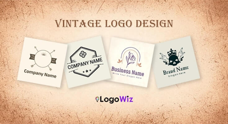
There’s something about a vintage logo that just works — it feels trusted, warm, and real before a customer even reads your brand name.
Explore Various Types Of Professional Vintage Logo Templates & Ideas
(Tap to Edit)
(Tap to Edit)

(Tap to Edit)






Vintage logo templates offer something modern designs often can’t — instant trust. In fact, the hand-lettered fonts, badge layouts, and earthy palettes create a sense of heritage and authenticity that makes even a new business feel established. In this guide, therefore, you’ll learn what makes vintage logo designs effective and how to customize a vintage logo that feels timeless — not outdated.
What Are the Core Elements That Make a Logo Feel Vintage?
“Vintage” isn’t just a filter you apply at the end. It’s a combination of very specific design decisions that, when stacked together, create that unmistakable aged, trusted, and handcrafted feel. Here are the core elements that make a logo feel vintage:
1. Typography That Carries History:
Serif fonts are the workhorses of vintage design — they communicate tradition and authority in ways modern fonts simply can’t. Script and hand-lettered styles, meanwhile, add human warmth, like someone drew your brand name by hand. Then there’s blackletter, dramatic and historic, perfect for craft beer labels or heritage clothing. Subsequently, hexagon logo templates showcase modern geometric trends influencing contemporary royal logo ideas significantly.
2. Badge and Emblem Shapes:
Circular badges, shield crests, and oval frames are the structural backbone of logos. They give the design a contained, official feel — like a product stamp or a seal of quality. Additionally, think about the logos on whiskey bottles or heritage coffee brands — many draw inspiration from royal logo design ideas, using badge formats that signal permanence and trust.
3. Muted, Earthy Color Palettes:
It’s actually the absence of bright color that makes a logo read as vintage. Simply think cream over white, burnt sienna over red, forest green over lime, and mustard over yellow — these are some logo color combinations to achieve that authentic retro feel. These slightly faded, desaturated tones reference a time before neon printing and digital screens.
4. Hand-Drawn Illustration and Worn Texture:
Vintage illustration mimics engraving and pen-and-ink styles — slightly uneven lines, cross-hatching for depth, and subjects like eagles, anchors, and botanical elements. Furthermore, when paired with a distressed texture overlay, this is what gives a logo that final lived-in feel. Without texture, however, even a well-composed vintage logo can look flat.
The Most Popular Vintage Logo Template Styles Right Now
Not all vintage logos look the same — and that’s actually a good thing. In fact, browsing vintage logo examples from different styles can help you find the one that fits your brand’s personality just right. Here, therefore, are the ones you’ll find most often in professional vintage logo templates.
1. Badge and Emblem Logos:
This is probably what you picture when someone says ‘vintage logo.’ Browsing badge logo design ideas can give you a clearer sense of how circular or shield-shaped designs, layered text, and ornate borders come together to create that bold, balanced look. They’re bold, balanced, and work for almost any industry.
Best for : craft breweries, coffee shops, barbershops, and outdoor brands.


2. Vintage Illustration Logos:
These are, without doubt, the most detailed of the bunch — animals, botanicals, landscapes, or trade tools combined with classic typography. Furthermore, they look absolutely stunning on packaging and merchandise. Reviewing vintage logo examples in this style can be a great source of inspiration before you create a vintage logo of your own.
Best for: distilleries, vineyards, adventure brands, farm-to-table restaurants.


3. Typography-Only Logos:
Sometimes the right typeface is all you need. No icon, no illustration — just beautifully spaced, well-chosen words. Simple, but incredibly powerful when done right.
Best for : fashion labels, upscale hospitality, heritage-positioned law firms.


4. Badge with Icon Logos:
A structured badge shape combined with a clear central icon — an animal, a plant, or a tool — is, without a doubt, the most versatile format in any vintage template library. Moreover, it consistently delivers the most professional-looking result of all vintage logo styles.
Best for: honestly, almost any business that wants to look established and trustworthy.



How to Customize a Vintage Logo Template (Even Without Design Skills)
Let’s be real — most people picture complicated software and an hour of frustration when customizing a logo. Fortunately, with the right tool, it’s surprisingly straightforward. Here’s exactly how to customize a vintage logo without any design background.
Step 1: Pick the Right Template First
This sounds obvious, but a lot of people skip it. They see a template that looks cool and jump straight in — then realize halfway through that a gothic emblem doesn’t really work for their organic skincare brand. Take five minutes upfront to browse vintage logo ideas by industry or style.
Step 2: Put Your Name In
Replace the placeholder text with your actual business name. Simple enough — but pay attention to how it sits in the layout. Does it feel balanced? Is anything getting cut off or cramped? Most quality templates are built to handle names of different lengths, but it’s worth checking before you go any further.
Step 3: Make the Colors Yours
You’re not locked into the template’s original palette. In fact, swapping the colors is one of the quickest ways to design a vintage logo that feels like it actually belongs to your brand. Subsequently, use the best logo maker apps to experiment with layouts and refine details.
Step 4: Sort Out the Icon
If the template lets you swap the central illustration — and most good ones do — use that flexibility. For instance, a coffee brand should have a coffee icon, while a barbershop should have scissors or a straight razor. Therefore, don’t leave a generic symbol in place just because it looks fine.
Step 5: Add Texture and Export
First, switch on whatever distressing or texture overlay your template includes. Even a light grain, after all, makes the whole thing feel more authentic and less digital. Then export in every format you’ll actually need — PNG for social and digital, SVG for your website, PDF or EPS for anything going to print.
FAQs About Vintage Logo Designs
To create a logo effectively, first define your brand personality and target audience. Next, explore vintage logo ideas and review a few vintage logo examples. Then, choose classic symbols like badges or crests, and refine your colors and typography for a balanced retro look. Using a logo maker like LogoWiz makes the process faster with editable templates and instant exports.
A frequent mistake is overcrowding the logo with too many elements. Additionally, using modern sans-serif fonts or overly bright colors can instantly kill the vintage vibe. Always keep it balanced and era-appropriate.
First, consider your industry and target audience — vintage works exceptionally well for food, fashion, and lifestyle brands. Furthermore, ensure the logo remains legible at small sizes, since intricate vintage details can blur when scaled down.
Typically, serif fonts, slab serifs, or vintage script typefaces best complement the retro aesthetic. Moreover, mixing two complementary fonts — one for the brand name and one for the tagline — adds visual depth.
Simply place the tagline inside a curved banner or beneath the main emblem. Consequently, this keeps the design cohesive while reinforcing your brand message in a classic, timeless way.
PNG is ideal for digital use with transparent backgrounds, while SVG works best for scalable designs. Additionally, PDF is the right choice for print. Fortunately, LogoWiz lets you export your vintage logo in all these formats instantly.