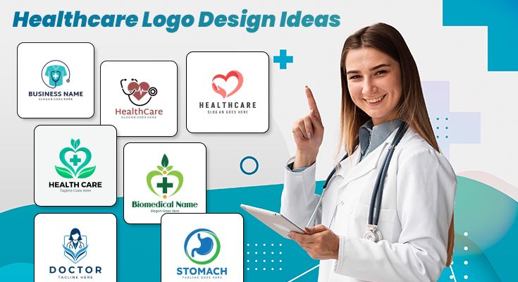
Discover visual branding solutions tailored for the medical industry. Healthcare logo designs serve as the foundation of your medical practice’s identity, communicating trustworthiness, professionalism, and patient care at a glance. The right visual symbol combines medical imagery, contemporary aesthetics, and meaningful color psychology to reflect your organization’s commitment to excellence.
Transform your medical brand visibility through strategic design choices. Unleash the potential of healthcare logo design ideas using an intelligent logo design app that adapts to your vision. Whether you’re building from scratch or refining existing concepts, explore how professional healthcare logos enhance recognition, patient trust, and market differentiation across digital and print channels.





FAQs About Healthcare Logo Designs
Creating effective healthcare logo designs becomes simple when you follow a quick, structured process. First, choose a clean symbol that reflects trust, clarity, and care. Moreover, starting with high-quality healthcare logo templates helps you work faster while still maintaining professional style and visual balance.
After choosing a layout, you can quickly adjust colors, shapes, and fonts for a polished look. Additionally, exploring basic healthcare logos gives you the direction needed to make a strong concept. Therefore, small improvements instantly make your artwork look modern and appealing.
Finally, export different sizes so your design stays clear everywhere. Although this process is short, it still creates meaningful results. Besides, you can use the free healthcare logo maker like Logowiz to test multiple looks easily and understand how simple changes impact your final healthcare logo ideas.
A memorable logo always uses clear shapes, soft curves, and calm colors that communicate safety and trust. Moreover, reviewing healthcare logo examples helps you understand what patients notice first. Additionally, combining smooth icons with readable text ensures your entire message stays simple and emotionally reassuring.
Moreover, symbols like hearts, crosses, hands, and caring figures often strengthen recognition. However, keeping them minimal prevents confusion. For instance, hospital logo templates show how small highlights or gentle color shifts create an approachable tone while still looking extremely professional within any healthcare environment or digital setting.
Finally, a logo becomes memorable when it reflects both clarity and reliability. Although many styles exist, clean layouts remain the strongest choice. Therefore, using thoughtful healthcare logo images or subtle gradients helps your branding stand out smoothly while supporting your overall healthcare logo design ideas effectively.
Yes, you can easily customize any ready-made layout. In fact, most healthcare logo templates allow quick adjustments in color, fonts, and shapes. Moreover, editing these elements helps your design express your tone clearly while still keeping the trusted style seen in healthcare logo designs.
Additionally, exploring different healthcare logo ideas lets you match your design with your unique identity. Although simple adjustments seem small, they transform the overall feeling. Moreover, layouts inside medical logo templates guide you with examples that keep your brand personality both approachable and visually consistent.
Furthermore, adding symbols that reflect your service types creates stronger relevance. However, keeping the design minimal maintains a clean look. Besides, experimenting with any healthcare logo maker like Logowiz helps you compare styles quickly and ensures your final logo feels personal yet fully aligned with your branding.
Many people use too many colors or overly detailed icons, and therefore, their logos lose clarity. However, sticking to minimal shapes keeps everything clean. Additionally, reviewing modern healthcare logo designs helps you avoid clutter and build a calm visual tone instantly.
Another mistake involves selecting unclear fonts. Moreover, thin or decorative styles make the message difficult to read, especially online. Therefore, exploring vision logo templates helps you understand how clear typography improves visibility and supports trust in all healthcare logo design ideas across different platforms.
Finally, skipping contrast adjustments leads to weak visibility. Although it seems minor, proper spacing and balance enhance recognition greatly. Besides, using inspiration from verified healthcare logo examples ensures you avoid these issues and maintain a consistent look even in small or low-light displays.
Medical logos must appear clean, organized, and universal. Therefore, simple symbols and soft colors are often required. Moreover, exploring trusted healthcare logo examples helps you understand these standards. Additionally, minimal icon shapes ensure your design stays easy to read across clinics, hospitals, and digital platforms.
Typography also plays a major role because clear fonts communicate professionalism instantly. However, bold decorative styles may appear unreliable. Besides, nursing logo templates show how balanced spacing and calm tones help designers achieve the gentle, trustworthy look expected in healthcare logo designs and widely accepted by medical institutions.
Furthermore, the industry prefers logos that function well at any scale. Although fancy elements may look attractive, they often lose detail when resized. Therefore, focusing on clean outlines helps your healthcare logo ideas stay long-lasting and meet all guidelines confidently in both digital and printed formats.
Yes, many free templates are designed with professional layouts. Moreover, these designs already include balanced icons and colors. Therefore, they help beginners create reliable healthcare logo designs quickly. Additionally, they offer enough flexibility to adjust the look without requiring advanced design knowledge or expensive software tools.
Although some free layouts are basic, they still provide excellent starting points. Besides, exploring healthcare logo templates can inspire new healthcare logo ideas and give you structure. Moreover, you can update colors and shapes instantly, which makes them great for small clinics or new medical brands.
However, ensure the license allows commercial usage. Additionally, selecting clean shapes helps maintain a professional tone. Therefore, reviewing trusted healthcare logo images helps you compare quality and choose options that look polished. Although free, these templates still support strong branding when used thoughtfully and carefully.
Modern designs now focus on soft gradients, gentle curves, and meaningful icons. Moreover, people prefer calm tones that communicate safety and care. Therefore, current healthcare logo designs often highlight simplicity. Additionally, this trend supports readability and helps your logo feel modern without losing emotional connection.
Additionally, abstract shapes are growing popular because they look clean on digital screens. Besides, exploring various logo design ideas helps you understand how minimal outlines create a strong impact. Moreover, hospital logo templates also show how blended symbols represent unity, healing, and support in a visually balanced manner.
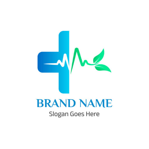
Furthermore, designers increasingly use nature-inspired icons like leaves and circles. Although small, these elements create softer impressions. Therefore, reviewing healthcare logo images helps you note emerging styles and apply them as inspiration for your own healthcare logo ideas, especially when seeking a friendly and modern identity.