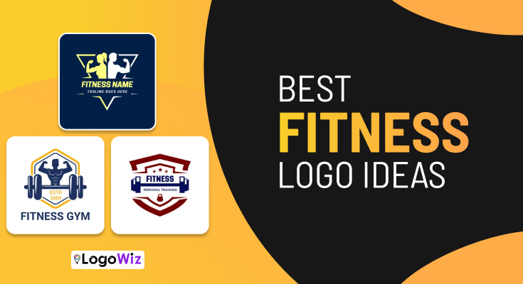
Fitness logo design ideas serve as the foundation of your brand’s visual identity in the health and wellness industry. Whether you’re launching a gym, personal training service, or fitness app, choosing the right design reflects your brand’s energy, values, and commitment to helping clients achieve their goals.
Browse through diverse fitness logo examples and elevate your brand presence. Additionally, these inspiring designs help you connect authentically with your target audience and stand out effectively.

(Tap to Edit)

(Tap to Edit)

(Tap to Edit)







FAQs About Fitness Logo Design
You can create a fitness logo easily using an online fitness logo maker or Best logo design apps. Start by selecting templates that align with your brand personality, adjust colors to match your identity, and experiment with various icons like kettlebells or running figures.
Additionally, looking at fitness logo examples provides valuable inspiration before finalizing your custom design. Try different font combinations that convey strength and energy while maintaining readability. Once satisfied, test your logo on various backgrounds and sizes to ensure versatility across all applications.
Including your business name in your fitness logo creates immediate brand recognition and helps new audiences identify your company quickly. Text-based logos work particularly well for fitness businesses with memorable or meaningful names. However, ensure typography complements rather than competes with iconic elements.
Nevertheless, balanced combination marks that integrate text with imagery offer the best of both approaches for most fitness businesses. Consider creating both text-inclusive and icon-only versions for different applications. Flexibility in logo variations ensures appropriate usage across diverse marketing channels and contexts.
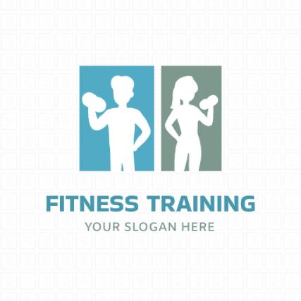
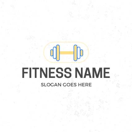
Essential elements for fitness logo design ideas include relevant icons like dumbbells, muscle silhouettes, or dynamic action poses that immediately convey your industry. Choose typography that reflects strength and modernity while remaining easily readable. Color schemes should evoke energy, motivation, and health-focused values consistently.
You can also take inspiration from gym logo designs, which often balance bold icons with minimal layouts for a strong and motivating look. Studying such examples helps you combine energy, power, and simplicity effectively, making your fitness logo both appealing and professional.
Fitness logos avoid trendy design elements that quickly become dated, instead focusing on classic principles of balance, simplicity, and versatility. They use enduring color schemes and typography that remain relevant across changing design trends. Consequently, these logos require fewer updates over time while maintaining recognition.
Similarly, sports logo Ideas also focus on universal shapes and clean forms that highlight motion and spirit. A well-crafted sports logo shares the same timeless quality as fitness designs, bold yet adaptable, ensuring your brand stays relevant and inspiring for years.
Bold colors like red, orange, and black work exceptionally well for fitness logo design ideas because they evoke energy, passion, and strength. Red stimulates action and excitement, while orange communicates enthusiasm and determination. Black conveys power, sophistication, and premium quality in fitness branding effectively.
However, don’t limit yourself to these traditional choices when exploring fitness logo ideas for your unique brand. Blue suggests reliability and professionalism, while green works beautifully for holistic fitness brands. Ultimately, your color selection should reflect your brand personality and target demographic preferences perfectly.
Using overly complex designs ranks among the most common fitness logo mistakes, as intricate details often become illegible when scaled down. Avoid cliche imagery like generic dumbbells that fail to differentiate your brand. Another frequent error involves selecting inappropriate color combinations that clash or fail to convey your brand personality effectively. Don’t overcrowd your fitness logo idea with too many elements, text, or visual components. Simple, versatile logos consistently outperform complicated alternatives in brand recognition.
Update your fitness logo only when significant business changes occur, such as rebranding, service expansions, or major shifts in the target demographic. Frequent changes confuse existing clients and diminish the brand recognition you’ve worked hard to establish over time. Typically, logos should remain consistent for years.
However, subtle refinements like modernizing typography or simplifying complex elements can keep your fitness logo design feeling fresh without abandoning recognition. Evaluate whether proposed changes genuinely improve your logo or simply reflect personal preference. Strategic updates preserve brand equity while keeping your visual identity contemporary.